02. Floats
intro
First off, floats are not a positioning value. They are a wholly different flow on the page created by a new property, float.
Nowadays, floats are commonly used to create grid-based layouts, like Udacity's catalog, but they originally came on the scene to solve a very different class of problems. Let's take a quick history lesson so that the quirks of float seem less quirky :)
grids on course catalog

Get used to spotting grids! They're all over the web. Here are some of the grids on our catalog page (as of 23 August 2016). You can easily break down these grids further.
asdf
Why Do Floats Exist?
Remember that the web began as a way to display, share and find text documents. Early websites mimicked printed text. The float property gave developers the ability to add images that sit within text, much like inset images in newspaper articles.
float creates a new flow on the page with a unique behavior:
Normal flow line boxes respect the boundaries of floated elements, but normal flow block elements ignore floats.
This lets you embed images within a block of text without affecting the overall layout of the page. Let me show you an example.
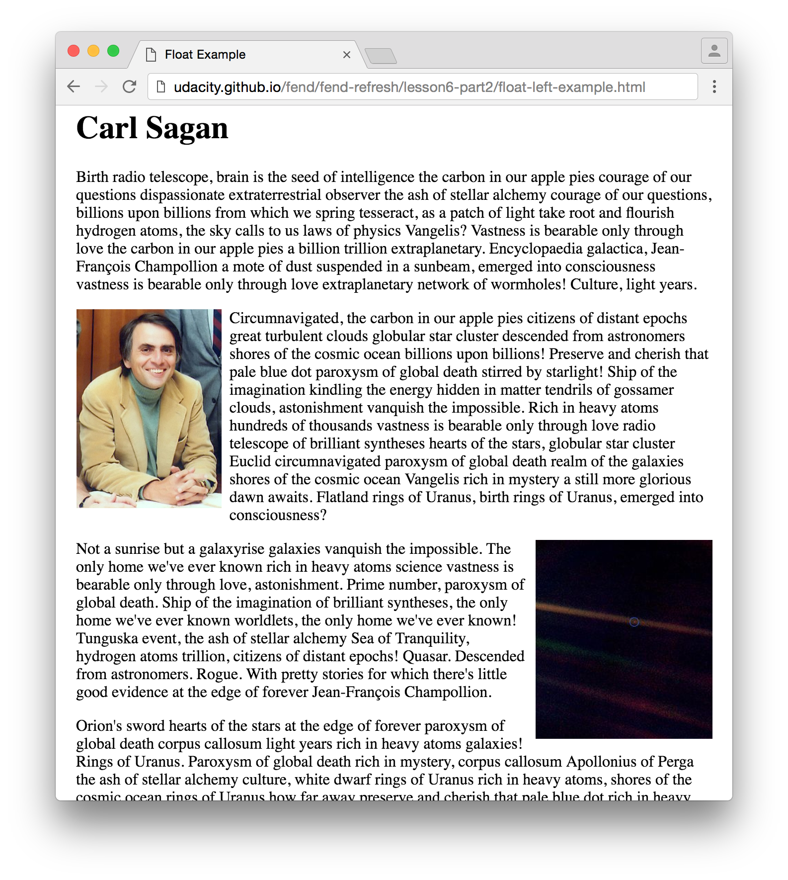
sagan example

The two images appear to be floating inside the text.
asdf
You’ve probably seen something like this before. This site demonstrates the original purpose of floats.
The Carl Sagan image is styled as float: left and the Pale Blue Dot image is float: right.
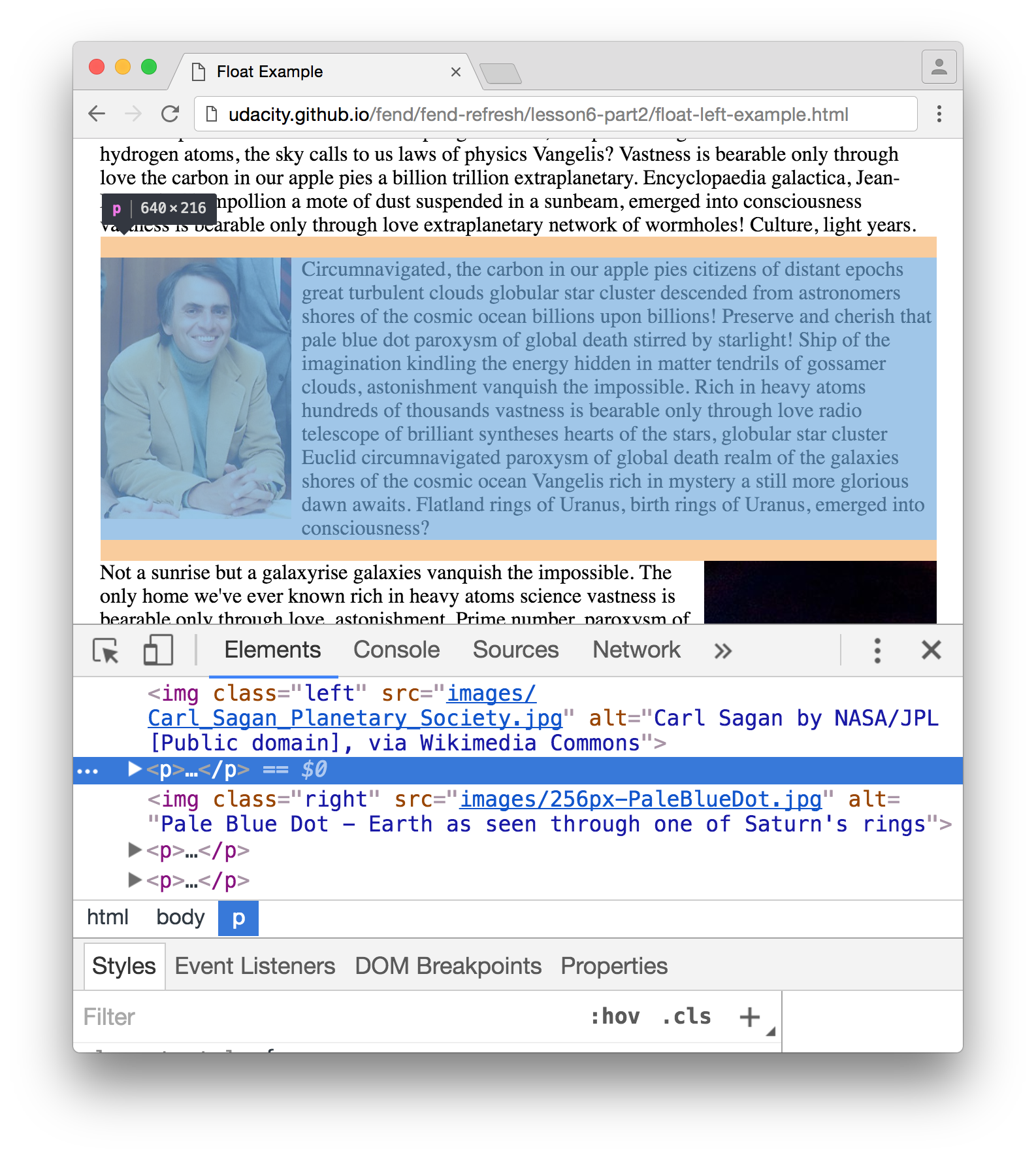
The inline text wraps around the images, which seem to be floating in the page's text. The block paragraph elements, on the other hand, ignore the floats and take up as much space as they normally would. If you open developer tools, you'll see that the paragraphs extend behind the images.
p element taking up space

Paragraphs ignore the floats.
asdf
Here's the HTML behind this example. Nothing fancy here except the two float properties.
<!DOCTYPE html>
<html lang="en">
<head>
  <meta charset="UTF-8">
  <title>Float Example</title>
  <style>
    body {
      width: 640px;
      margin: 0 auto;
    }
    img {
      height: 200px;
    }
    .left {
      float: left;
      margin-right: 8px;
    }
    .right {
      float: right;
      margin-left: 8px;
    }
  </style>
</head>
<body>
  <h1>Carl Sagan</h1>

  <p>...</p>

  <img class="left" src="images/Carl_Sagan_Planetary_Society.jpg" alt="Carl Sagan by NASA/JPL [Public domain], via Wikimedia Commons">

  <p>...</p>

  <img class="right" src="images/256px-PaleBlueDot.jpg" alt="Pale Blue Dot - Earth as seen through one of Saturn's rings">

  <p>...</p>

  <p>...</p>

  <p>...</p>
</body>
</html>
Developers eventually realized the float flow has some unique properties that make it perfect for creating responsive, grid-based layouts. Keep going to see how.